 |
Logistic Regression Analytics Platform
 |
Introduction |
The goal in Logistic Regression is to assign probabilities to model scores, creating a reliable
ranking system that can be used straightaway to evaluate the risk involved in financial and insurance
applications, to rank potential respondents in a marketing campaign, or to evaluate the risk of contracting a disease.
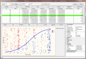
The Logistic Regression Framework of GeneXproTools builds on the models it generates with its evolutionary algorithms, combining the canonical logistic regression technique to estimate probabilities for each model score. And once you know the probability of an event, you can also make categorical predictions about that event (Yes / No or
Positive / Negative) and consequently evaluate the confusion matrix both for the Training and Validation/Test data.
Thus, the innovative Logistic Regression Framework of GeneXproTools offers an
extremely
robust hybrid system in which powerful multivariate nonlinear models, empowered by traditional statistical modeling techniques, are totally created by evolution.
With the Logistic Regression Framework of GeneXproTools you can:
 |
Getting Started |
In order to access the Logistic Regression Framework of GeneXproTools you need to:
- Create a statistical model that explains a binary dependent variable, using either the Logistic Regression Framework or the Classification Framework of GeneXproTools.
In the Logistic Regression Framework the default fitness
function is the
Positive Correl fitness as this kind of function gives the best results with the standard 0/1
class encoding.
In the Classification Framework you also have access to a
wide variety of
fitness functions and
adaptive rounding thresholds that offer interesting alternatives for exploring the solution space.
-
In the Logistic Regression Framework, click the Results menu and then choose one of the available
analytics tools:
Quantile Analysis, ROC Curve,
Cutoff Points, Gains Chart,
Lift Chart, Log Odds,
Logistic Fit, or Confusion Matrix.
This activates the number-crunching process of the Logistic Regression Analytics
Platform that starts with the evaluation of the
Quantile Table and finishes with the creation of the
Logistic Regression Model and the evaluation of the
Confusion Matrix. When all the calculations are done, you just navigate
the different options (different Tables and Charts, different
Datasets, and different Models) to
evaluate the accuracy and generalizability of your logistic regression models.
In the Logistic Regression Analytics Platform of GeneXproTools you can:
- Analyze and create Quantile Tables and Charts;
perform Quantile Regression; analyze the
ROC Curve of your models; visualize the
Optimal Cutoff Point for your test scores; study the
Gains and Lift Charts of your models;
access the
Log Odds Chart used to evaluate the slope and intercept of the
Logistic Regression Model; visualize how well your logistic
regression model fits the data in the
Logistic Fit Chart; and compare and analyze
Logistic & ROC Confusion Matrices using both 2 x 2 Contingency Tables and
innovative quantile-based Distribution Charts.
-
Copy all the Tables and Charts to the clipboard.
All the Tables and Charts generated within the Logistic Regression
Window can be copied to the clipboard through the context
menu. Tables can be copied in their entirety or you can copy just
selected rows or individual columns.
-
Copy the Statistics Report.
The Stats Report summarizes all the relevant parameters and
statistics derived from all the analyses (Quantile
Regression,
ROC Curve, Cutoff Points,
Gains Chart, Lift Chart,
Log Odds, Logistic Fit, and
Confusion Matrices) performed for the
active model and selected dataset. It also contains relevant
information about the training and validation/test data, such as class
distribution and number of records. And finally, the Stats Report
also summarizes some basic information about the model, such as its
fitness and accuracy and if any calculation errors occurred during
the computation of the model scores. Within the Logistic Regression
Window all such calculation errors (which can happen when processing
unseen
data, which includes not only the validation/test set but also the "training dataset" if it was
replaced by a different one or if the model itself was modified by
the user in the Change Seed Window) return zero so that the calculations can resume. Note,
however, that GeneXproTools flags these errors clearly, highlighting them in
light red in all the tables where the
model outputs are shown (ROC Table, Cutoff Points
Table,
Logistic Fit Table, and
Confusion Matrix Table).
-
Choose a different number of bins (quantiles) for your Quantile Table and then see immediately how it affects the
Logistic Regression Model through the
Logistic Fit Chart.
The number of bins is an essential parameter for most of the analyses
performed in the Logistic Regression Window (Quantile
Regression,
Gains Chart, Lift Chart,
Log Odds and Logistic Regression, Logistic Fit, and
Logistic Confusion Matrix) and therefore
it is saved for each model.
Note, however, that the basic model parameters, namely the slope,
intercept, and logistic threshold,
of each model are the ones evaluated during training for a specific training data. These parameters
can only be changed through the Update Current Threshold or Update All Thresholds
in the History Menu.
So, for example if you change the number of bins in the Logistic Regression Window, GeneXproTools
re-evaluates all the analyses and computations and shows you what-if scenarios if such changes were
implemented.
However, all the basic model parameters remain fixed unless you make the necessary changes
(namely, a different number of bins or a different dataset) and then update the threshold(s).
It’s also important to note that in the Logistic Regression Window all the calculations
are made for the Training or the Validation datasets as defined in the Data Panel.
So, for example if you used a subsample of the training dataset to create your models, you should expect
slightly different values for the basic model parameters and on all calculations that
depend on them, like for example the Logistic Confusion Matrix.
By using the ROC-derived accuracy as your golden standard (it is quantile-independent and remains unchanged for a particular model), you can fine-tune the number of
bins to get the most of your models. Note, however, that
it is not uncommon to get better accuracy on the Logistic Confusion Matrix, which of course is indicative of a very good
Logistic Fit.
-
Access the validation/test dataset so that you can not only test further the predictive accuracy of your model
but also build logistic regression models with it.
The validation/test dataset was never brought into contact with the model during the training process and therefore constitutes an excellent blind test for checking the predictive accuracy of your model
on unseen data.
You access the validation/test dataset by choosing Validation in the Dataset combobox. GeneXproTools then creates a specific
Quantile Table for the validation/test dataset and
also performs the complete logistic regression analysis for this dataset. Note, however, that if you want to use this logistic regression model
(that is, the slope, intercept and logistic threshold evaluated for the validation/test set) for scoring new cases using the
Scoring Engine of GeneXproTools, you’ll have to replace the original training dataset with this one and then recalculate the logistic parameters (the slope and intercept of the
Log Odds Chart) with this new operational dataset.
As mentioned above, you recalculate the basic model parameters through the Update Current Threshold or Update All Thresholds
in the History Menu.
-
Analyze all the intermediate models created in a run by selecting any model in the
Model selector box.
Each model in the Run History is identified by its ID and respective Training
Accuracy for easy access in the Model selector box. Note that when you close the Logistic Regression Window, the last observed model will remain your active model.
Data modelers are understandably interested in the best-of-run model, but it’s
also great fun to get a glimpse of how evolution works by being able to see how intermediate models behave and how their performance becomes better and better with time. But this process is also important to develop a good intuition and learn some tips that might prove useful
in making the most of evolution.
-
Choose to browse all the available Tables and Charts in synchrony or asynchronously by
checking the Sync Tables & Charts checkbox.
By default, the Tables & Charts of the Logistic Regression Framework of GeneXproTools move in synchrony. But you can have them move independently so that you can look at any
one table while analyzing a certain chart
and vice versa. Another advantage of having
Tables & Charts move independently is that it’s much faster to move from chart to chart when using very large datasets.
-
Access the Logistic Regression Online Help.
Through the Help button you have access to the
Online Knowledge Base of GeneXproTools
which includes the Logistic Regression
Documentation on all the
analyses of the Logistic Regression Analytics Platform.
In order to make predictions or rank new cases within GeneXproTools, you need to:
-
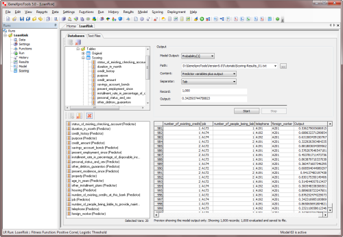
Go to the Scoring Panel.
To score a database or Excel file, on the Scoring menu select Databases or go to the Scoring Panel and select the Databases Tab. For scoring data kept in text files, on the Scoring
menu select Text Files or go to the Scoring Panel and select the Text Files Tab.
-
In the Scoring Panel select the model output type in the Model Output
combobox and then enter the path for both the source data and output file.
The Scoring Engine of GeneXproTools uses the JavaScript code of your model to perform the computations as it
also includes the code for the
Derived Variables (UDFs) and
Custom Functions (DDFs).
-
Then press the Start button to begin the scoring process.
GeneXproTools saves the scoring results to a file which contains the
predictions of your model for all the new cases in the source file. For small
datasets (up to 20 variables and 2000 records) GeneXproTools also shows the
scoring results in the table of the Scoring Panel; for more than 20 variables
GeneXproTools displays only the model output in the Scoring Table.
 |
Quantile Analysis and Regression |
Quantile Tables are by themselves powerful analytics tools, but they are also at the heart of
the
Logistic Regression Model and
Logistic Fit. In addition, they are also the basis of
powerful analytics tools such as
Gains and Lift Charts, which are essential for making good decisions about the quality
of a model and to estimate the benefits of using a model.
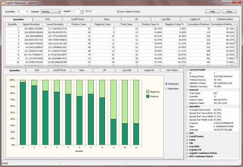
The number of quantiles or bins is entered in the Quantiles combobox at the top of the Logistic Regression Window. The most commonly used
Quantile Tables such as Quartiles, Quintiles, Deciles, Vingtiles, Percentiles, and 1000-tiles are listed by default, but you can type any valid quantile number in the box to build the most appropriate quantile table for your data.
The number of quantiles is an essential parameter for most of
the analyses performed in the Logistic Regression Window (obviously Quantile
Regression and Analysis,
but also Gains Chart, Lift Chart,
Log Odds and Logistic Regression, Logistic Fit, and
Logistic Confusion Matrix) and therefore
it is saved for each model (the number of bins is in fact an
essential parameter of all
Logistic Regression fitness functions and therefore it can also
be changed in the Fitness Functions Tab of the Settings Panel).
On their own, Quantile Tables are widely used in risk assessment applications and in a variety of response models to create
rankings or scores. Percentiles, for instance, are very popular and often used for that purpose alone. But in GeneXproTools, Quantile Tables are also used to create a more sophisticated ranking system: the
probabilistic ranking system of the Logistic Regression Model. This model estimates unique probabilities for each case,
forming a very powerful ranking system, perfectly bounded between 0
and 1.
GeneXproTools shows its Quantile Tables in 100% stacked column charts, where the distribution of both
Positive and Negative categories is shown for all the bins. By moving the cursor over each column, GeneXproTools shows both the percentage and absolute values for each class. For more than 20
bins, a scroll bar appears at the bottom of the
Quantile Chart and by moving it you can see the distribution over all the range
of model outputs.
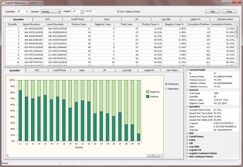
Besides allowing the visualization of Quantile Tables, GeneXproTools also shows and performs a weighted
Quantile Regression. Both the slope
and intercept of the regression line, as well as the R-square, are
computed and shown in the Quantile Regression Chart.
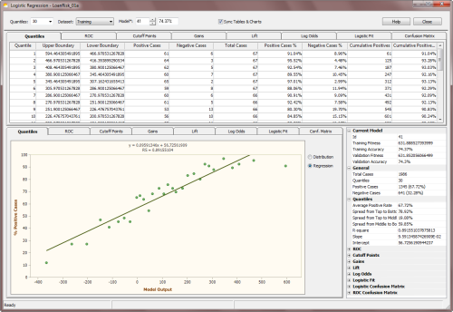
These parameters form the core of the Quantile Regression Model and can be used both to
evaluate rankings and to make discrete classifications
in a fashion similar to what is done with the
Logistic Regression Model. Within the
Logistic Regression Framework of GeneXproTools, however, only the
Logistic Regression Model is used to evaluate rankings
(probabilities, in this case) and to estimate the most likely class.
Furthermore, the Scoring Engine of
GeneXproTools also uses the Logistic Regression Model to make
predictions, not the Quantile Regression Model.
Note also that in the X-axis of the Quantile Regression Chart, GeneXproTools plots model outputs and therefore you can see clearly how spread out model scores are. Note also that, in the Quantile Regression Chart, upper boundaries are used if the
predominant class is “1” and the model is normal, or the predominant class is “0” and the model is inverted; and lower boundaries are used if the
predominant class is “1” and the model is inverted, or the
predominant class is “0” and the model is normal.
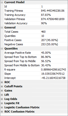
On the companion Statistics Report shown on the right in the
Logistic Regression Window (the Quantiles section opens up every time the Quantiles Chart Tab is selected), GeneXproTools also shows the
Spread from Top to Bottom, Spread from Top to Middle, and
Spread from Middle to Bottom (when the number of
bins is even, the middle value is the average of the two middle bins). Note that negative values for the spreads, especially the Spread from Top to Bottom, are usually indicative of an inverted model. In absolute terms, however, the wider the spread the better the model.
 |
ROC Analysis |
Receiver Operating Characteristic or ROC Curves are powerful visualization tools that allow a quick assessment of the quality of a model. They are usually plotted in reference to a
Baseline or Random Model, with the
Area Under the ROC Curve (or AUC for short) as a
widely used indicator of the quality of a model.
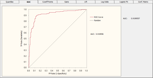
So, for the Random Model, the area under the ROC curve is equal to 0.5, which means that the further up (or down, for inverted models) a model is from 0.5 the better it is. Indeed, for perfect models on both sides of the random line, what is called
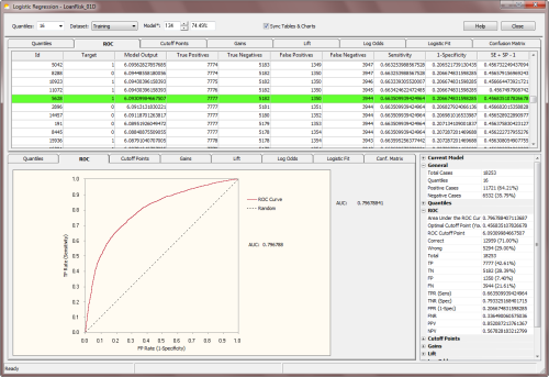
ROC heaven takes place when AUC = 1 (for normal models) or AUC = 0 (for inverted models). Below is shown a typical ROC
curve obtained for a risk assessment model using a training dataset with
18,253 cases. This model, which has a classification accuracy of
74.15% and an R-square of 0.2445 (R-square values might seem
unusually low, but in risk assessment applications R-square values
around 0.22 are considered excellent and indicative of a good
model), has an AUC of
0.7968. Note that the classification accuracy reported refers to the
accuracy of the logistic regression model, not the ROC accuracy
evaluated using the ROC Cutoff Point.
Below is shown a Gallery of ROC
Curves typical of intermediate models generated during a GeneXproTools run.
These ROC curves were specifically created for a risk assessment problem with a training dataset with
18,253 cases and using a small population of just 30 programs.
The Classification Accuracy, the R-square, and the Area
Under the ROC Curve (AUC) of each model,
as well as the generation at which they were discovered, are also
shown as illustration.
From top to bottom, they are as follow
(see also the twin
Gallery of Logistic Fit Charts in the
Logistic Fit section):
- Generation 0, Accuracy = 65.33%, R-square = 0.0001, AUC = 0.5273
- Generation 5, Accuracy = 66.03%, R-square = 0.0173, AUC = 0.5834
- Generation 59, Accuracy = 66.92%, R-square = 0.0421, AUC = 0.6221
- Generation 75, Accuracy = 68.99%, R-square = 0.1076, AUC = 0.7068
- Generation 155, Accuracy = 69.93%, R-square = 0.1477, AUC = 0.7597
- Generation 489, Accuracy = 74.15%, R-square = 0.2445, AUC = 0.7968
|
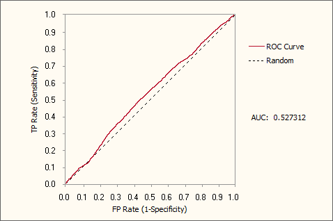 Generation 0, Accuracy = 65.33%, R-square = 0.0001, AUC = 0.5273
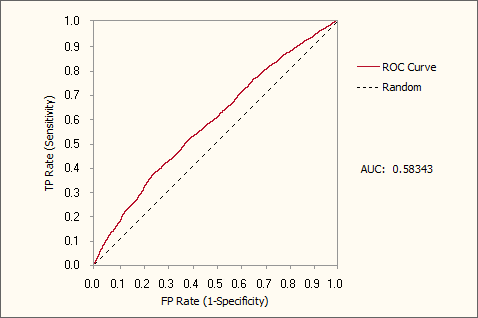 Generation 5, Accuracy = 66.03%, R-square = 0.0173, AUC = 0.5834
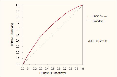 Generation 59, Accuracy = 66.92%, R-square = 0.0421, AUC = 0.6221
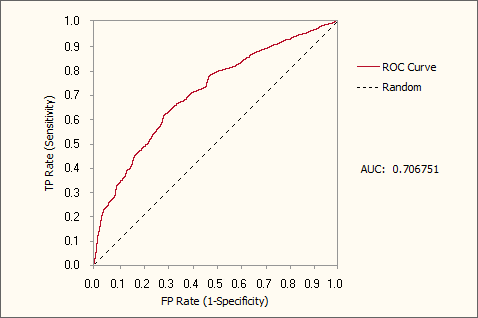 Generation 75, Accuracy = 68.99%, R-square = 0.1076, AUC = 0.7068
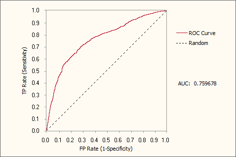 Generation 155, Accuracy = 69.93%, R-square = 0.1477, AUC = 0.7597
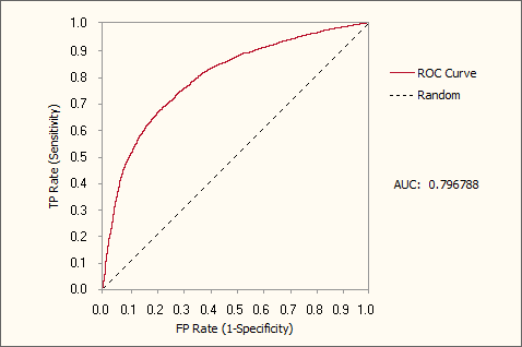 Generation 489, Accuracy = 74.15%, R-square = 0.2445, AUC = 0.7968
ROC Curves and ROC Tables are also useful to evaluate what is called the
Optimal Cutoff Point, which is given by the maximum of the Youden index. The Youden index
J returns the maximum value of the expression (for inverted
models, it returns the minimum):
J = max[SE(t) + SP(t) - 1]
where SE(t) and SP(t) are, respectively, the
sensitivity and specificity over all possible
threshold values t of the model. Thus, the ROC Cutoff Point corresponds to the model output at the Optimal Cutoff Point.
In the ROC Table, GeneXproTools also shows all “SE + SP -1” values and highlights in light green the row with the Optimal Cutoff Point and corresponding
ROC Cutoff Point. These parameters are also shown in the
ROC Statistics Report.

The ROC Cutoff Point can be obviously used to
evaluate a Confusion Matrix (in
the Logistic Regression Window it is called
ROC Confusion Matrix in order to distinguish it from the
Logistic Confusion Matrix) and, in the Cutoff Points Table, you have access to the Predicted Class, the Match, and Type
values used to build the ROC Confusion Matrix (you can see the graphical representation of the
ROC Confusion Matrix in the Confusion Matrix
section).
The visualization of the ROC Confusion Matrix is a valuable tool and can be used to determine the right number of
bins to achieve a good fit with the
Logistic Regression Model. But GeneXproTools allows you to do more with the ROC Confusion Matrix and associated
ROC Cutoff Point. By allowing the
conversion of Logistic Regression runs to the Classification Framework, you can use this model, with its finely adapted
ROC Cutoff Point, straightaway to make binary classifications using the Classification Scoring Engine of GeneXproTools.
Note, however, that you'll have to change the Rounding Threshold to
ROC Threshold in the Settings Panel (when a Logistic Regression run
is converted to Classification, the Rounding Threshold is set to
Logistic Threshold by default) and then recalculate all model
thresholds by selecting Update All Thresholds in the History menu.
The Youden index is also used to evaluate a wide range of useful statistics at the Optimal Cutoff Point (OCP statistics for short). They include:
- TP (True Positives)
- TN (True Negatives)
- FP (False Positives)
- FN (False Negatives)
- TPR (True Positives Rate or Sensitivity)
- TNR (True Negatives Rate or Specificity)
- FPR (False Positives Rate, also known as 1-Specificity)
- FNR (False Negatives Rate)
- PPV (Positive Predictive Value)
- NPV (Negative Predictive Value)
- Classification Accuracy (Correct Classifications)
- Classification Error (Wrong Classifications)
How they are calculated is shown in the table below ("TC" represents the number of Total Cases):
| TPR (Sensitivity) |
TP / (TP + FN) |
| TNR (Specificity) |
TN / (TN + FP) |
| FPR (1-Specificity) |
FP / (FP + TN) |
| FNR |
FN / (FN + TP) |
| PPV |
TP / (TP + FP), and TP + FP
≠ 0 |
| NPV |
TN / (TN + FN), and TN + FN
≠ 0 |
| Classification Accuracy |
(TP + TN) / TC |
| Classification Error |
(FP + FN) / TC |
It is worth pointing out that OCP statistics are quantile-independent and
are therefore a
good indicator of what could be achieved with a model in terms of logistic fit and accuracy.
 |
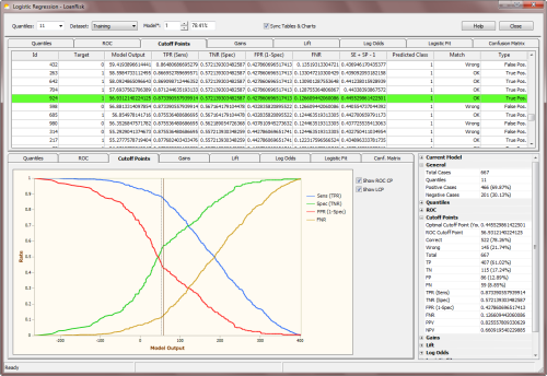
Cutoff Points |
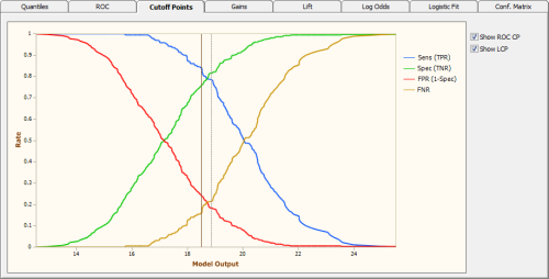
The Cutoff Points Analysis complements the
ROC Analysis of the previous section. The
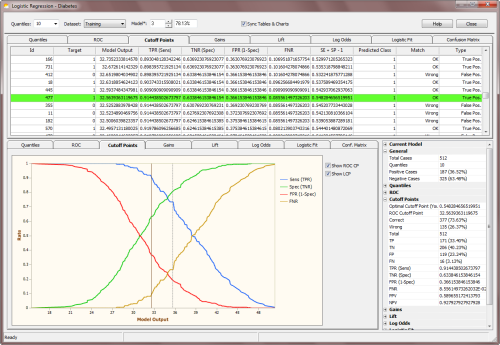
Cutoff Points Chart shows clearly the intersection of both the sensitivity (TPR) and specificity (TNR) lines and also
the intersection of the FPR line with the FNR line. Seeing how these four lines change with
the model output is a great aid to choosing the
Ideal Cutoff Point for your test values.
The Ideal Cutoff Point varies from problem to problem, as one might be interested in minimizing or maximizing different things. Sometimes the goal is to minimize the number of false positives; other times the number
of false negatives; still other times one
might need to maximize the number of true positives or true negatives. With the help of the Cutoff Points Chart of GeneXproTools you can see clearly the best way to move your model threshold to achieve your goals.
Notwithstanding, there is a generic Optimal Cutoff Point. This Optimal Cutoff Point is given by the
Youden index and you can see where it exactly lies in the Cutoff Points Chart. When you
check the Show ROC CP checkbox, GeneXproTools draws the ROC
Cutoff Point in dark brown. GeneXproTools also shows the
Logistic Cutoff Point in the
Cutoff Points Chart
so that you can easily compare both cutoff points. To draw the
Logistic Cutoff Point just check the checkbox Show LCP.
The Youden index J returns the maximum value of the expression
(for inverted models it returns the minimum):
J = max[SE(t) + SP(t) - 1]
where SE(t) and SP(t) are, respectively, the
sensitivity and specificity over all possible
threshold values t of the model. Thus, the ROC Cutoff Point corresponds to the model output at the Optimal Cutoff Point.
In the Cutoff Points Table, GeneXproTools also shows all “SE + SP -1” values and highlights in light green the row with the Optimal Cutoff Point and corresponding
ROC Cutoff Point. These parameters are also shown in the
companion Cutoff Points Statistics Report.
The ROC Cutoff Point can be obviously used to evaluate a Confusion Matrix (in GeneXproTools it is called
ROC Confusion Matrix) and, in the Cutoff Points Table, you have access to the Predicted Class, the Match, and Type
values used to evaluate the ROC Confusion Matrix (you can see the graphical representation of the
ROC Confusion Matrix in the Confusion Matrix
section).
The visualization of the ROC Confusion Matrix is a valuable tool and can in fact be used to determine the right number of
bins to achieve a good fit with the
Logistic Regression Model. But GeneXproTools allows you to do more with the ROC Confusion Matrix and associated
ROC Cutoff Point. By allowing the
conversion of Logistic Regression runs to the Classification Framework,
you can use this model with its ROC Cutoff Point straightaway to make discrete classifications using the Classification Scoring Engine of GeneXproTools.
Note, however, that you'll have to change the Rounding Threshold to
ROC Threshold in the Settings Panel (when a Logistic Regression run
is converted to Classification, the Rounding Threshold is set to
Logistic Threshold by default) and then recalculate all model
thresholds by selecting Update All Thresholds in the History menu.
The Youden index is also used to evaluate a wide range of useful statistics at the Optimal Cutoff Point (OCP statistics for short). They include:
- TP (True Positives)
- TN (True Negatives)
- FP (False Positives)
- FN (False Negatives)
- TPR (True Positives Rate or Sensitivity)
- TNR (True Negatives Rate or Specificity)
- FPR (False Positives Rate, also known as 1-Specificity)
- FNR (False Negatives Rate)
- PPV (Positive Predictive Value)
- NPV (Negative Predictive Value)
- Classification Accuracy (Correct Classifications)
- Classification Error (Wrong Classifications)
How they are calculated is shown in the table below ("TC" represents the number of Total Cases):
| TPR (Sensitivity) |
TP / (TP + FN) |
| TNR (Specificity) |
TN / (TN + FP) |
| FPR (1-Specificity) |
FP / (FP + TN) |
| FNR |
FN / (FN + TP) |
| PPV |
TP / (TP + FP), and TP + FP
≠ 0 |
| NPV |
TN / (TN + FN), and TN + FN
≠ 0 |
| Classification Accuracy |
(TP + TN) / TC |
| Classification Error |
(FP + FN) / TC |
It is worth pointing out that OCP statistics are quantile-independent and
are therefore a good indicator of what could be achieved with a model in terms of logistic fit and accuracy.
 |
Gains Chart |
The Gains Chart of GeneXproTools is quantile-based and shows the
cumulative gain as more cases are included in a campaign or test. The
Lift Curve is compared to both a Random Model and an
Ideal Model, showing clearly the advantages of using a model as opposed to not using one.
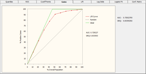
The Random Line in the Gains Chart represents the average response
rate. And the Ideal Line represents a perfect model that is never
wrong and therefore could select all the estimated positive
responses. So, the further up (or down, for inverted models) the
Lift Curve is from the Random Line the better the model.
The Gains Ranking Quality (GRQ) is a good indicator of the quality of a model. It is defined as the relation between the area under the Ideal Model and the area under the
Lift Curve. It ranges from -1 to +1, with zero corresponding to the Random Model. The better the model the closer the GRQ gets to either +1 or -1 (for inverted perfect models GRQ = -1, whereas for normal perfect models GRQ = 1). As an additional quality measure, the
Area Under the
Lift Curve (represented by AUC in the Gains Chart) is also evaluated and shown both in the
Gains Chart and in the companion
Gains Statistics Report.
 |
Lift Chart |
The Lift Chart of GeneXproTools shows both the Lift Curve and
Cumulative Lift Curve on the same graph. These curves are also shown in relation to a
Random Model and an Ideal Model.
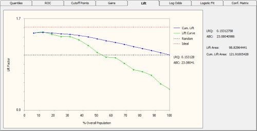
The Random Line in the Lift Chart represents the average
response rate. And the Ideal Line represents a perfect model
that is never wrong and therefore could select all the estimated
positive responses. The point where the Lift Curve crosses the Random
Line corresponds approximately to the percentage of the population beyond which the benefits from using the model are lost.
Other useful visual clues from the Lift Chart include the Area Between both
Lift Curves (represented by
ABC in the Lift Chart). Theoretically, the greater ABC the better the model. The individual areas under each of the
Lift Curves are also computed and shown both on the Lift Chart and in the companion
Lift Statistics Report.
The Lift Ranking Quality (LRQ) is yet another useful indicator of the accuracy of a model. It corresponds to the ABC area normalized against the area under the Ideal
Line. Negative values both for the ABC and LRQ are indicative of an inverted model.
 |
Log Odds and Logistic Regression |
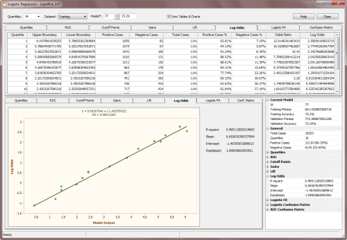
The Log Odds Chart is central to the Logistic Regression Model.
It’s with its aid that the slope and intercept of the
Logistic Regression Model
are calculated. And the algorithm is quite simple. As mentioned previously,
it’s quantile-based and, in fact, just a few additional calculations
are required to evaluate the regression parameters.
So, based on the Quantile Table, one first evaluates the
odds
ratio for all the bins (you have access to all the values on the
Log
Odds Table under Odds Ratio). Then the natural logarithm of this
ratio (or the Log Odds) is evaluated
(the Log Odds values are also shown on the Log Odds Table under Log
Odds).
Note, however, that there might be a problem in the evaluation of
the log odds if there are bins with zero positive cases. But this
problem can be easily fixed with standard techniques. Although rare for large datasets, it
can sometimes happen that some of the bins end up with zero
positive cases in them. And this obviously results in a calculation
error in the evaluation of the natural logarithm of the odds ratio.
GeneXproTools handles this with a slight modification to the Laplace
estimator to get what is called a complete Bayesian formulation with
prior probabilities. In essence, this means that when a particular Quantile Table has bins with
only negative cases, then
we do the equivalent of priming all the bins with a very small
amount of positive cases.
The formula GeneXproTools uses in the evaluation of the Positives
Rate values pi for all the quantiles is the following:

where μ is the Laplace estimator that in GeneXproTools has
the
value of 0.01; Qi and Ti are, respectively, the number of
Positive
Cases and the number of Total Cases in bin i; and P is the
Average Positive Rate of the whole dataset.
So, in the Log Odds Chart, the Log Odds values (adjusted or not with the Laplace strategy) are plotted on the Y-axis against the Model
Output in the X-axis. And as for Quantile Regression, here there are also special rules to follow, depending on whether the
predominant class is “1” or “0” and whether the model is normal or inverted. To be precise, the Log Odds are plotted against the
Model Upper Boundaries if the predominant class is “1” and the model is normal, or the
predominant class is “0” and the model is inverted; or against the
Lower Boundaries if the predominant class is “1” and the model is inverted, or the
predominant class is “0” and the model is normal.
Then a weighted linear regression is performed and the slope and
intercept of the regression line are evaluated. And these are the parameters that will be used in the
Logistic Regression Equation to evaluate the probabilities.
The regression line can be written as:

where p is the probability of being “1”; x is the Model Output; and
a and b are, respectively, the slope and intercept of the regression line. GeneXproTools draws the regression line and shows both the equation and the R-square in the
Log Odds Chart.
And now solving the logistic equation above for p, gives:
which is the formula for evaluating the probabilities with the
Logistic Regression Model. The probabilities estimated for each case are
shown in the Logistic Fit Table.
Besides the slope and intercept of the Logistic Regression Model, another useful and
widely used parameter is the exponent of the slope, usually represented by
Exp(slope). It describes the proportionate rate at which the predicted odds ratio changes with each successive unit of
x. GeneXproTools also shows this parameter both in the Log Odds Chart and in the
companion
Log Odds Stats Report.
 |
Logistic Fit Chart |
The Logistic Fit Chart is a very useful graph that allows not only a quick visualization of how good the
Logistic Fit is (the shape and steepness of the sigmoid curve are excellent indicators of the
robustness and accuracy of
the model), but also how the model outputs are distributed all over the
model range.
The blue line (the sigmoid curve) on the graph is the logistic transformation
of the model output x, using the
slope a and intercept b calculated in the Log Odds Chart and is evaluated by the already familiar formula for the probability p:

Since the proportion of Positive responses (1’s) and Negative
responses (0’s) must add up to 1, both probabilities can be read on
the vertical axis on the left. Thus, the probability of “1”
is read directly on the vertical axis; and the probability of “0”
is the distance from the line to the top of the graph, which is 1
minus the axis reading.
But there’s still more information on the Logistic Fit Chart. By plotting the dummy data
points, which consist of up to 1000 randomly selected model
scores paired with dummy random ordinates, one can clearly visualize
how model scores are distributed. Are they all clumped together or are
they finely distributed, which is the telltale sign of a good model?
This is valuable information not only to guide the modeling process
(not only in choosing model architecture and composition but also in
the exploration of different fitness
functions and class encodings that you can use to model your
data), but also to sharpen one’s intuition and knowledge about the
workings of learning evolutionary systems.
Indeed, browsing through the different models created in a run might
prove both insightful and great fun. And you can do that easily as
all the models in the Run History are accessible through the Model
selector box in the Logistic Regression Window. Good models will
generally allow for a good distribution of model outputs, resulting in a unique score
for each different case. Bad models, though, will usually
concentrate most of their responses around certain values and
consequently are unable to distinguish between most cases. These are
of course rough guidelines as the distribution of model outputs
depends on multiple factors, including the type and spread of input
variables and the complexity of the problem. For example, a simple
problem may be exactly solved by a simple step function.
Below is shown a Gallery of
Logistic Fit Charts typical of intermediate models generated during a GeneXproTools run.
It was generated using the same models used to create the
twin
ROC Curve Gallery
presented in the ROC Analysis section.
The models were created for a risk assessment problem with a training dataset with
18,253 cases and using a small population of just 30 programs.
The Classification Accuracy, the R-square, and the Area
Under the ROC Curve (AUC) of each model,
as well as the generation at which they were discovered, are also
shown as illustration.
From top to bottom, they are as follow:
- Generation 0, Accuracy = 65.33%, R-square = 0.0001, AUC = 0.5273
- Generation 5, Accuracy = 66.03%, R-square = 0.0173, AUC = 0.5834
- Generation 59, Accuracy = 66.92%, R-square = 0.0421, AUC = 0.6221
- Generation 75, Accuracy = 68.99%, R-square = 0.1076, AUC = 0.7068
- Generation 155, Accuracy = 69.93%, R-square = 0.1477, AUC = 0.7597
- Generation 489, Accuracy = 74.15%, R-square = 0.2445, AUC = 0.7968
|
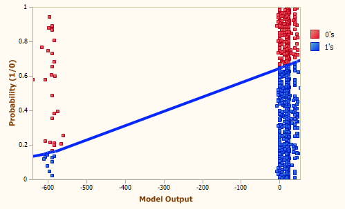 Generation 0, Accuracy = 65.33%, R-square = 0.0001, AUC = 0.5273
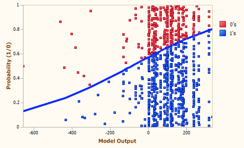 Generation 5, Accuracy = 66.03%, R-square = 0.0173, AUC = 0.5834
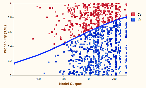 Generation 59, Accuracy = 66.92%, R-square = 0.0421, AUC = 0.6221
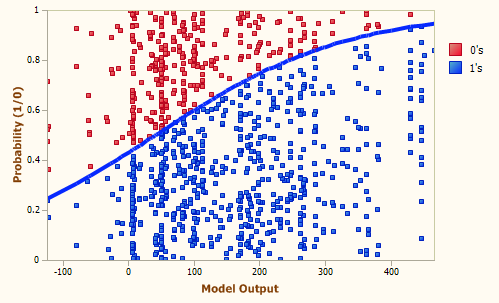 Generation 75, Accuracy = 68.99%, R-square = 0.1076, AUC = 0.7068
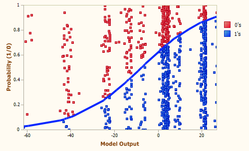 Generation 155, Accuracy = 69.93%, R-square = 0.1477, AUC = 0.7597
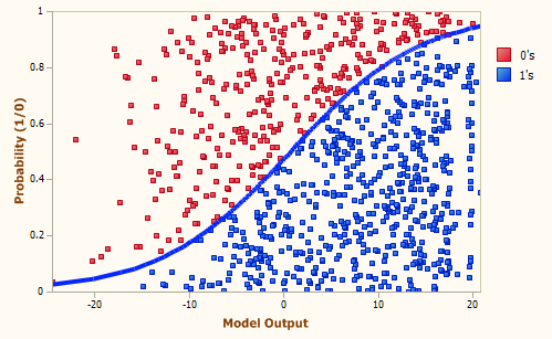 Generation 489, Accuracy = 74.15%, R-square = 0.2445, AUC = 0.7968
Besides its main goal, which is to estimate the probability of a
response, the Logistic Regression Model can also be used to make
categorical or binary predictions.
From the logistic
regression equation introduced in the
previous section, we know that when a Positive event has the
same probability of happening as a Negative one, the log odds term
in the logistic regression equation becomes zero, giving:

where x is the model output at the Logistic Cutoff
Point; and a and b are, respectively, the slope
and the intercept of the regression line.
The Logistic Cutoff Point can be obviously used to
evaluate a
Confusion Matrix (in the Logistic Regression Window it is called Logistic
Confusion Matrix to distinguish it from the
ROC Confusion Matrix), in which model scores with Prob[1] higher than or equal to 0.5
correspond to a
Positive case and a Negative otherwise.
In the Logistic Fit Table, GeneXproTools shows the Most
Likely Class, the Match, and Type values of the Logistic
Confusion Matrix (you can see the graphical representation of the
Logistic Confusion Matrix in the Confusion
Matrix Tab). For easy visualization, the model output closest to
the Logistic Cutoff Point is highlighted in light green in the
Logistic Fit Table. Note that the exact value of the Logistic Cutoff
Point is shown in the companion Logistic Fit Stats Report.
 |
Confusion Matrix |
In the Logistic Regression Window, GeneXproTools evaluates and shows two different
Confusion Matrices: the Logistic Confusion Matrix and the
ROC Confusion Matrix.
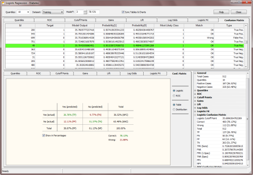
The Logistic Confusion Matrix is derived from the
logistic
regression model and evaluates the Most Likely Class using the predicted probabilities evaluated for each
record. Thus, probabilities higher than or equal to 0.5
(the Logistic Cutoff Point) indicate a Positive response or a
Negative response otherwise. The model output closest to the Logistic Cutoff
Point is highlighted in light green in the Confusion Matrix Table.
Note that the exact value of the Logistic Cutoff Point is shown in
the companion Logistic Confusion Matrix Stats Report.
In the Confusion Matrix Table you have access not only to the predicted probabilities for each
case but also to the
Most Likely Class plus how these predictions compare to actual target values.
In the Confusion Matrix Table, GeneXproTools also shows the Type of each classification (true positive, true negative,
false positive, or false negative) for all sample cases.
These results are then displayed graphically, both in a 2-way table
(the Confusion Matrix) and in a quantile-based distribution chart
(the Confusion Matrix Distribution Chart).
The
ROC Confusion Matrix, on the other hand, is evaluated using the Optimal Cutoff Point
(or ROC Cutoff Point),
a parameter derived from the ROC Curve. This means that for model scores higher than or equal to the
ROC Cutoff Point, a
Positive response is predicted and a Negative response otherwise. Note that, despite displaying
in the Confusion Matrix Tab the diagram representation of the ROC Confusion Matrix, the confusion matrix data (Predicted Class, Match, and Type) are shown in the Cutoff Points Table.
Note, however, that the statistics evaluated at the Optimal Cutoff Point (or
OCP statistics, for short) might result in slightly different values than the
ones derived from the ROC Confusion Matrix. Remember that OCP statistics are evaluated using the direct readings of all the parameters
at the Optimal Cutoff Point (this point, which is highlighted in green both in the ROC
Curve Table and Cutoff Points Table,
is also highlighted in the Confusion Matrix Table in green for a comparison with the Logistic
Cutoff Point). For inverted models, for instance, the ROC Confusion Matrix was adjusted to match the default predictions of binomial logistic regression, which always predicts the “1” or positive class. The OCP statistics, however, are not adjusted for inversion and correspond to the actual values for the model. Also note that if you decide to export an inverted model to the Classification Framework, the confusion matrix you’ll get there
using the ROC Cutoff Point will match the OCP statistics rather than the ROC Confusion Matrix.
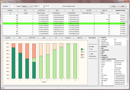
Besides the canonical confusion matrix, GeneXproTools also shows a
new kind of confusion matrix. This new confusion matrix plots the
distribution of all the classification outcomes (TP, TN, FP, FN) along the different quantiles or
bins. This shows clearly what each model is doing, and where their strengths and weaknesses
lie. And by comparing both
Confusion Matrix
Distribution Charts (logistic and ROC), you can also see how both systems are operating. This is valuable information that you can use in different ways, but most importantly you can use it to fine-tune the number of quantiles in your system so that you can get the most of the logistic fit (as a reminder, the ROC Confusion Matrix is quantile-independent and can be used as reference for fine-tuning the logistic
regression model that is quantile dependent).
 |
Modeling Strategies |
The addition of the Logistic Regression Analytics Platform to GeneXproTools
started in response to specific user requests and the analysis of how GeneXproTools is being used in the wild.
The implementation of the Logistic Regression Analytics Platform uses the
Logistic Regression Framework in the model creation phase,
with a total of 59
built-in Fitness Functions. The default
fitness function for Logistic Regression is the
Positive Correl
fitness function,
as correlation-based fitness functions are extremely efficient at finding
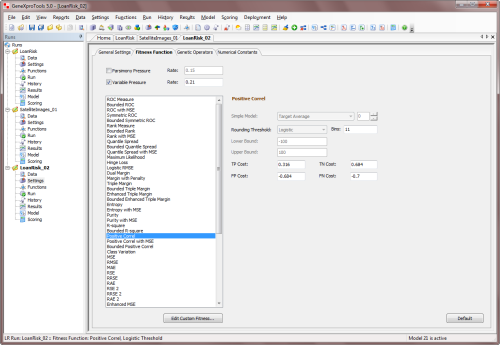
very good logistic regression models. In GeneXproTools several
correlation-based fitness functions are implemented, with the
Enhanced Series combining bounded positive correlations with
different error measures:
The innovative
Classification Scatter Plot and
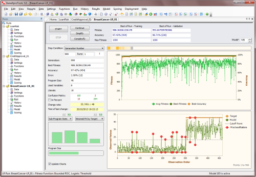
Binomial Fit Charts of the Run Panel (Binomial Fit by Target,
Binomial Fit by Model, and Binomial Fit by Target &
Model) are very useful to get
an idea of the kind of range the evolving models are exploring.
Indeed, different fitness functions work on different ranges and
therefore explore the solution space differently. Indeed, the reason
why both correlation-based fitness functions work so well with the
standard 0/1 class encoding is that they can get free of the
restricting 0/1 target range of the standard class encoding.
For instance, a fitness function such as the one based exclusively
on the Mean Squared Error (MSE) will only be able to drive evolution
towards optimal solutions around the boundaries of the standard 0/1
class encoding. Note, however, that the
MSE fitness function of GeneXproTools for Logistic Regression is
richer than a simplistic fitness function based on the MSE alone, as
it combines the MSE with the
Cost/Gain Matrix and implements a
control for favoring solutions with continuous model outputs.
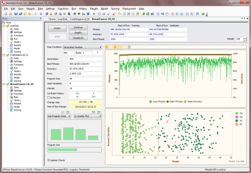
Notwithstanding, if you use a different Class Encoding,
say [-1000, 1000], you'll be able to explore different solution
spaces with most fitness functions. For example, a fitness function
based on the MSE alone, although still confined to the target range,
would have much more room to explore and come up with
good ranges for the model scores. This is of course the most
important prerequisite for designing a good model. And you can observe
this change in behavior straightaway with the help of the
Classification Scatter Plot and different
Binomial Fit Charts
(sorted either by target or model or by target & model), available both in the Run Panel and Results Panel.
GeneXproTools allows you to Change the Class Representation easily and therefore you can experiment with different class encodings without much trouble (and you can just as easily revert to the standard 0/1 encoding if you feel more comfortable with it, although it has no bearing on the real meaning of the binary representation and how everything is processed and shown in the Logistic Regression Window, with the
minimum value always representing the
standard "0" or Negative cases, and the maximum value
representing the standard "1" or Positive
cases).
To change the Class Encoding within GeneXproTools, choose Class Encoding
in the Data menu. This opens the
Class Encoding Window of GeneXproTools. In the Class Encoding Window, you can choose
your encoding from several default values, but you can also experiment with all kinds of binary encodings, including systems with
floating-point values, by entering any pair of two different numbers in the Change To box in the Other Encodings option.
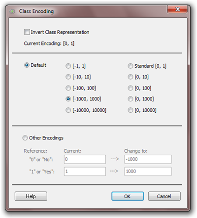
Also notice that you can invert your class representation by
checking
the Invert Class Representation checkbox. This means that
what you had originally represented as “0” will become “1” and vice
versa. This might prove useful in certain modeling situations, but
please keep in mind that GeneXproTools will be handling what you originally had as negative cases as 1’s.
And this means that within the Logistic Regression Framework all the predictions and analyses will be made for these new 1’s because the
Logistic Regression Technique is by default designed to always predict the 1’s. Remember, however, that you can always revert to the original encoding by inverting the
representation once more.
Also worth mentioning in this section about modeling strategies is the fact that GeneXproTools
allows the
conversion of Classification runs to Logistic Regression and vice versa. This obviously means
that you can explore all the
fitness functions available for
Classification (there are a total of 52 built-in fitness
functions for Classification) to evolve your models.
Then, in the Logistic Regression Framework you have access to
all the analyses of the Logistic Regression Analytics Platform, including the
evaluation of
Quantile Tables, analysis of
Gains and Lift Charts,
the complete
ROC Analysis with the Cutoff Points Charts, and of course
the evaluation
of the probabilities with
the
Logistic Regression Algorithm and also the
comparison of the
Logistic and ROC Confusion Matrices.
When a Logistic Regression run is converted to Classification, the
Logistic Cutoff Point is automatically
set up as default in the Fitness Function Tab. This ensures that the
Logistic Cutoff Point evaluated for each model in the Logistic
Regression Framework remains unchanged in the new Classification
run.
It is also worth pointing out that, when you convert a Logistic
Regression run to Classification, you can also use the
ROC Cutoff Point as your
Rounding Threshold. Note, however, that in this case you'll have to
change the
Rounding Threshold to ROC Threshold in the Fitness Function Tab. The confusion matrix you'll get in this case on the
Classification Framework will match obviously the
ROC Confusion Matrix.
 |
Testing a Model |
The predictive accuracy of logistic regression models can be evaluated like all the models are evaluated in GeneXproTools.
That is, as soon as evolution stops, and if a validation/test set is available, both the fitness and
classification accuracy are immediately evaluated for the validation dataset and the results are shown straightaway on the
Run Panel. Furthermore, an additional set of statistics, including the
Correlation Coefficient, the R-square, the Recall, the Precision and the Area Under the ROC Curve, are
evaluated and shown in the
Results Panel for both the training and validation datasets.
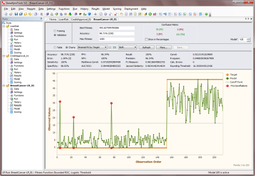
When both the Fitness and Classification Accuracy obtained for the
validation set are about the same as the values obtained for the training set, this is a good indicator that your model is a good one and therefore can be used to make
accurate predictions.
Additionally, within the Logistic Regression Window, GeneXproTools allows you to run the whole
set of analytics tools on the
validation dataset, namely the evaluation and analysis of
Quantile Tables, ROC Curves
& Tables,
Cutoff Points, Gains and
Lift Charts,
Log Odds Analysis & Logistic Regression and
Logistic Fit, and
ROC & Logistic Confusion Matrices. For that you just have to select
Validation in the Dataset
combobox in the Logistic Regression Window.
Note, however, that this additional testing procedure builds its own
Quantile Table and also evaluates and uses its own slope and intercept for the
Logistic Regression Model. This means
that the logistic regression parameters
evaluated for the training dataset are not operational
during this testing and new ones are being
evaluated for the validation dataset, which
might prove useful as a form of further testing the model.
It’s worth emphasizing that the logistic regression model that GeneXproTools deploys during
scoring, either internally or using the generated code for deployment to Excel or elsewhere,
uses the slope and intercept evaluated for the training
dataset that was used during the learning process, unless an update
of the threshold was carried out using the
Update Current Threshold or Update
All Thresholds functionality accessible
though the History menu.
 |
Making Categorical and Probabilistic Predictions |
The goal in Logistic Regression is to assign probabilities to model scores, creating a reliable
ranking system that can be used straightaway to evaluate the risk involved in financial and insurance applications, to rank potential respondents in a marketing campaign, or to evaluate the risk of contracting a disease.
The Logistic Regression Framework of GeneXproTools builds on the model scores
it generates with its innovative hybrid system where Evolutionary Algorithms
are combined with the canonical Logistic Regression Technique. This
powerful logistic regression model is then used to estimate probabilities
for each model score, which in turn can be used to make categorical
predictions for each outcome. These categorical or binary predictions are
summarized in the
Logistic Confusion Matrix of the Logistic Regression Window and also in the
Confusion Matrix of the Run Panel and the Results Panel.
GeneXproTools scores new cases using the JavaScript code
it generates for your logistic regression model, allowing you to choose the kind of model output
through the Model Output combobox. By choosing either Probability[1] or Most Likely Class in the Model Output combobox,
you have access to the complete code of your logistic regression models.
Moreover, in the Model Panel, you can also access all the generated code in all
the programming languages available in GeneXproTools (19 built-in programming languages
plus all programming languages you add through the Custom Grammars of GeneXproTools).
Additionally, by deploying your models and ensembles to Excel, you
have very conveniently within Excel the complete
code of your logistic regression models in Excel VBA.
This way you can make predictions straightaway with your logistic regression models in Excel.
In order to score new cases with the Scoring Engine of GeneXproTools you need to:
- Go to the Scoring Panel and select the type of model
output in the Model Output combobox.
You can choose either Probability[1], Most Likely Class, or
Raw
Model Output.
- Enter the path for the scoring data or connect to the Excel file
or database where your new cases are kept.
- Enter the path for the file in which the scoring results will be saved.
If you also want to include the input values in the output file, you have to choose
Predictor Variables Plus Output in the Content
combobox.
- Press the Start button to score your new cases.
GeneXproTools shows the scoring results for the first 2000 cases in
the Scoring Table of the Scoring Panel for a quick preview. All the
scoring results, however, are saved to file.
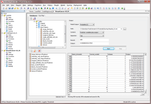
The Scoring Engine of GeneXproTools allows you to score as many new cases as you wish without
exiting the GeneXproTools environment. But you can also score your new cases outside GeneXproTools using the code it automatically generates for your models in any of the
19 programming languages it supports for Logistic Regression.
And as mentioned above, through the innovative functionality of
Excel Deployment of Models & Ensembles, the generated Excel
VBA code of your models can be immediately used to automatically deploy the
code of all your logistic regression models to Excel where you then can conveniently
carry out the scoring of your models and your model ensembles.
 |
Evaluating the Variable Importance of Model Variables |
GeneXproTools uses a sophisticated stochastic method to compute the
variable importance
of all the variables in a model. For all logistic regression models the importance of
each model variable is computed by randomizing its input values and then computing the
decrease in the R-square between the model output and the target. The results for all
variables are then normalized so that they add up to 1.
GeneXproTools evaluates the variable importance of all the variables (original and derived)
in a model and shows the results in the Statistics Report in the
Data Panel. The variable importance
is also shown graphically in the Variable Importance Chart. The Variable Importance Chart is
available through the Statistics Charts in the Data Panel when
Model Variables is selected in
the
Variables combobox.
 |
Converting Classification Runs to Logistic Regression |
GeneXproTools allows you to convert runs created within the Classification Framework to Logistic Regression. This means that you’ll be able
to generate probabilities with these models using the Logistic Regression Algorithm
implemented in the Logistic Regression Framework. Note, however, that you'll
only be able to reap all the benefits of the Logistic Regression Algorithm if
your classification models were created with the
Logistic
Threshold; for other
threshold
types you'll likely see a slight decrease in accuracy when you convert your
Classification runs to Logistic Regression. Notwithstanding, converting your
Classification runs to Logistic Regression might prove useful even in those
cases, as the algorithm that generates the probabilities in the Classification
Framework is less robust than the powerful and innovative Logistic Regression
Algorithm implemented in the Logistic Regression Framework.
You can convert any Classification run to the Logistic Regression
Framework. But you may also consider creating new ones with the sole purpose of exploring all the
Classification fitness functions (there are a total of
52 built-in fitness functions in the Classification Framework, which are a nice addition to the
59 built-in fitness functions of Logistic Regression).
Then, in the Logistic Regression Framework you have access to all the analyses
of the Logistic Regression Analytics Platform, including the evaluation of
Quantile Tables, analysis of
Gains and Lift Charts,
the complete
ROC Analysis with the Cutoff Points Charts, and of course
the evaluation of the probabilities with the
Logistic Regression Algorithm and also the
comparison of the
Logistic and ROC Confusion Matrices.
In addition, you can use these models as seed (either in the Logistic Regression
Framework or back in the Classification Framework) to create better models from
them. You can obviously repeat this process for as long as you wish, until you
obtain the right model for your data.
To convert a Classification run to Logistic Regression you need to:
-
Within the Classification Framework, choose Convert To Logistic Regression in the
File menu.
This opens the Save As dialog box and also asks if you want to save the current run before converting it to Logistic Regression. This way you will be able to come back to it if you need to.
-
Type the run name for the new Logistic Regression run and then click Save.
When you click Save, GeneXproTools takes you immediately to the
Logistic Regression Framework. Note that the
model statistics of the converted models
in the run History will only match the ones evaluated in the Classification Framework
if the classification models were created with the
Logistic Threshold; if a different
threshold was used you’ll get slightly different values when you do
Refresh All
to update all calculations in the History Panel or when you analyze your models
in the Results Panel. Model statistics are also updated when you go to the
Data Panel.
 |
Converting Logistic Regression Runs to Classification |
GeneXproTools also allows you to convert Logistic Regression runs to Classification. This means that, among other things, you can easily access all the
Classification fitness functions to drive
model evolution (there are a total of 52 built-in fitness functions in the
Classification Framework, which are a nice addition to the
59 built-in fitness functions of Logistic Regression). By going back and forth between both platforms, you can explore different modeling tools to fine-tune your models.
When a Logistic Regression run is converted to Classification, the
Logistic Cutoff Point is automatically
set up as default in the Fitness Function Tab. This ensures that the
Logistic Cutoff Point evaluated for each model in the Logistic
Regression Framework remains unchanged in the new Classification
run.
It is also worth pointing out that when you convert a Logistic
Regression run to Classification you can also use the
ROC Cutoff Point as your
Rounding Threshold. Note, however, that in this case you'll have to
change the
Rounding Threshold to ROC Threshold in the Fitness Function Tab. The confusion matrix you'll get in this case on the
Classification Framework will match obviously the
ROC Confusion Matrix.
To convert a Logistic Regression run to Classification you need to:
- Within the Logistic Regression Framework, choose Convert To Classification in the
File menu.
This opens the Save As dialog box and also asks if you want to save the current run before converting it to Classification. This way you will be able to come back to it if you need to.
- Type the run name for the new Classification run and then click Save.
When you click Save, GeneXproTools takes you immediately to the Classification Framework.
When converting a Logistic Regression run to Classification, GeneXproTools will try to match
the fitness function whenever possible (for example, the
ROC Measure fitness function or
the
Positive Correl fitness function exist in both frameworks, but the
R-square fitness function
or the
Symmetric ROC fitness function exist only in the Logistic Regression Framework); when a match
is not possible, the
Positive Correl fitness function is set by default.
Thus, in the History Panel the fitness values that are shown there
upon conversion correspond to the ones evaluated in the
Logistic Regression Framework. By choosing Refresh All
you can rapidly update these values to their true values in this
new context.
 |
Importing Regression Models to Logistic Regression |
GeneXproTools allows you to import models created within the Regression Framework to Logistic Regression,
as long as their structure and composition are compatible.
When Regression models are imported into a Logistic Regression run, GeneXproTools evaluates
automatically all the logistic regression parameters for all the models, namely the
Slope,
Intercept and Logistic Cutoff Point. This allows you to generate probabilities with these models
straightaway using the Logistic Regression Algorithm implemented in the Logistic Regression Framework.
Then, in the Logistic Regression Framework you have access to all
the analyses of the Logistic Regression Analytics Platform,
including the evaluation of
Quantile Tables, analysis of
Gains and Lift Charts,
the complete
ROC Analysis with the Cutoff Points Charts, and of course
the evaluation of the probabilities with the
Logistic Regression Algorithm and also the
comparison of the
Logistic and ROC Confusion Matrices.
In addition, you can use these models as seed to create better models from them.
The main advantage of importing models created in the Regression Framework to Logistic Regression
is that you can use all the Regression fitness functions to drive model evolution (there are a
total of 49 built-in fitness functions in the Regression Framework, which are a nice addition
to the 59 built-in fitness functions of Logistic Regression). By going back and forth between
both platforms, you can explore different modeling tools to fine-tune your models. Below is
shown a model created in the Regression Framework using the
RMSE fitness function.
And now the same model imported to the Logistic Regression Framework, where it can be either used
as seed to create a better model or deployed straightaway and evaluated.
Last modified:
October 24, 2013
Cite this as:
Ferreira, C. "Logistic Regression Analytics Platform." From GeneXproTools
Tutorials – A Gepsoft Web Resource.
https://www.gepsoft.com/tutorials/LogisticRegressionAnalyticsPlatform.htm
|

