| The Training & Testing Results Windows
allow you to
visualize and evaluate the accuracy of your models and gives access to the following
settings and features:
Training Option
By selecting this option you have access to all the statistical evaluations
of your model on the training set. You also can compare the output of your model with the target output on the training set using either a
table or different charts.
Testing Option
By selecting this option you have access to all the statistical evaluations
of your model on the testing set. You also can compare the output of your model with the target output on the testing set using either a
table or different charts.
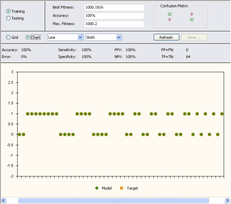
Best Fitness
Shows the fitness
of the active model on the current set.
Accuracy
Shows the classification
accuracy of the active model on the current set.
Max. Fitness
Shows the value of maximum fitness on the
current set.
Confusion Matrix
Shows the confusion
matrix, where true positives followed by
false negatives are shown on the first row, and
false positives followed by
true negatives are shown on the second row.
For easy reference, the true positives and true negatives are shown
in green, whereas the false positives and the false negatives are
shown in red.
Grid Option
By selecting the Grid Option you can compare the output of your model with the target output on the
current set on a spreadsheet where the target and model output are
placed side by side.
Chart Option
By selecting the Chart Option you can compare the output of your model with the target output on the
current set using different charts. You choose the chart type with the aid of two boxes. In the first you select the chart type (Line, Area,
Bar, Step, 3D Line, 3D Area, 3D Bar, or 3D Step). And in the second you select the data you want to plot (Model, Target, or Both).
The plots show only a maximum of 50 points at a time and, therefore, for datasets
with more than 50 samples you must move the scroll bar at the
bottom of the chart to see all the results. Then, by placing the
cursor over the chart, GeneXproTools shows you the exact range used to draw the plot.
Refresh Button
Refreshes the panel. This button is particularly useful when you change your model in the
Change Seed window or change the
current
set or the fitness function.
Save Button
This button is only active when the Grid Option
is selected as it saves all the results in the table to a file.
Accuracy
Shows the classification accuracy on the current set.
Error
Shows the value of the classification error on the current set.
Sensitivity
Shows the value of the sensitivity on the current set.
Specificity
Shows the value of the specificity on the current set.
PPV
Shows the value of the positive predictive value on the current set.
NPV
Shows the value of the negative predictive value on the current set.
FP+FN
Shows the number of samples wrongly classified on the current set, which corresponds obviously to the sum of
false positives and
false negatives. Wrongly classified samples are easily identified by a yellow strip and the identifier WRONG in the table.
TP+TN
Shows the number of samples correctly classified on the current set, which corresponds obviously to the sum of
true positives and
true negatives.
|