| The Chart Option allows you to compare
visually the output of your model with the target output using
different kinds of curve fitting charts:
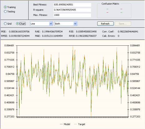
Chart Type Box
In this list box you select the chart type: Line, Area,
Bar, Step, 3D Line, 3D Area, 3D Bar, or 3D Step.
Chart Data Box
In this list box you select the data you want to plot: Model, Target, or Both. In case of calculation errors, the sample with the
calculation error is skipped and a discontinuity is observed in the plot.
The plots show only a maximum of 250 points at a time and, therefore, for datasets
with more than 250 samples you must move the scroll bar at the
bottom of the chart to see all the results. Then, by placing the
cursor over the chart, GeneXproTools shows you the exact range used to draw the plot.
|