| In the Run Panel is where modeling takes
place and is where you see what is going on. To
create a model, just click the Evolve button.
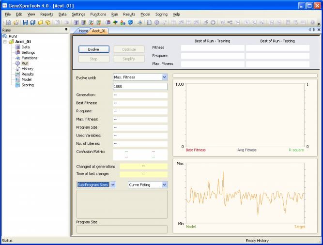
You will notice that while GeneXproTools 4.0 is modeling your data, the Stop button is switched on, enabling you to halt the learning process anytime you see fit.
Anytime you click the Stop button, a model has been selected among the thousands of models created and evaluated during a run. This is the best-of-run model and now you can:
- Take a closer look at this model using the wide range of tools of
GeneXproTools 4.0, such as looking at its structure (size,
shape, and elements), translate it into the language of your
preference, check its statistics and how it generalizes in the
Results Panel, twinkle with its structure in the Change Seed
window, evaluate its performance in a different testing set, and
so on.
- Use the model to make
predictions.
- Try to evolve an even better model starting from exactly this point in the solution
space (evolve from seed).
- Try to simplify it.
The last options are accomplished here in the Run Panel
by clicking the Optimize or Simplify buttons, which are activated after
each run.
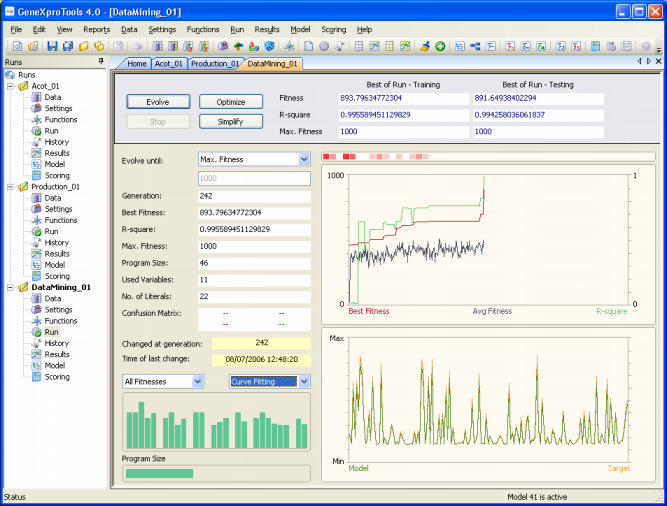
GeneXproTools 4.0 allows you to monitor the modeling
process by plotting the essential parameters of a run during the discovery process, including average fitness
of the population and the fitness and R-square/Accuracy of the best-of-generation model.
In addition, GeneXproTools allows you to visualize the modeling
process by plotting the essential features of a run during the discovery
process. In the Run Panel, a total of nine different charts are
shown:
- The Variables Usage map.
This map shows not only the variables that are being used by the
best-of-generation models but also their weight. Not only after
a run but also during evolution, by placing the cursor over each
square you can access the variable ID and the number of times it
appears in the current model. And by clicking the right button
of your mouse, you can also change its appearance: Heat Map,
Random Colors, or Monochromatic.
- The Evolutionary Dynamics chart.
This chart shows
the average fitness of the population plus the fitness and R-square/Accuracy of the best-of-generation model.
For a good adaptation, the plot for average fitness should never come near the plot for best fitness, otherwise the system is losing genetic diversity and becoming too uniform for an efficient evolution. Whenever this is happening in your system, you should obviously increase the
genetic diversity of the evolving populations by choosing the right set of genetic operators and adjusting their rates.
- The Average/Best Size chart.
This chart plots together the average program size of the population
and the program size of the best-of-generation model.
This chart is especially useful during simplification
and can be activated any time during evolution by selecting Avg/Best
Size in the rightmost combo box in the bottom.
- The Curve Fitting chart (for Function Finding and Time Series
Prediction).
This chart plots the first 250 data points of the training set
and shows how well the evolving models are fitting the target.
The Curve Fitting chart can be activated any time during
evolution by selecting Curve Fitting in the rightmost combo box
in the bottom.
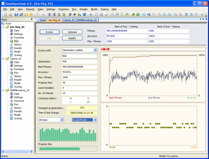
- The Target/Model chart (for Classification and Logic
Synthesis).
This chart plots the first 50 data points of the training set
and shows how well the evolving models are fitting the target.
The Target/Model chart can be activated any time during
evolution by selecting Target/Model in the rightmost combo box
in the bottom.
- The Sub-Program Sizes chart.
This chart shows
the sizes of all the sub-programs in the best-of-generation model.
Not only after a run but also during evolution, by placing the
cursor over each bar you can access the size of all sub-programs
in your model. The Sub-Program Sizes chart can be activated any
time during evolution by selecting Sub-Program Sizes in the
leftmost combo box in the bottom.
- The All Sizes chart.
This chart shows
the sizes of all the models in the population. Not only after a run
but also during evolution, by placing the cursor over each bar
you can access the size of a particular model; the
best-of-generation model always occupies the first position so
you can also easily see how it fares relatively to the others.
The All Sizes chart can be activated any time during evolution
by selecting All Sizes in the leftmost combo box in the bottom.
- The All Fitnesses chart.
This chart shows
the fitnesses of all the models in the population. Not only after a
run but also during evolution, by placing the cursor over each
bar you can access the fitness of a particular model; the
best-of-generation model always occupies the first position so
you can also easily see how it fares relatively to the others.
The All Fitnesses chart can be activated any time during
evolution by selecting All Fitnesses in the leftmost combo box
in the bottom.
- The Program Size chart.
This chart shows
the size of the best-of-generation model. Not only after a run but
also during evolution, by placing the cursor over the horizontal
bar you can access the size of the best model.
The evolutionary process can be stopped whenever you are satisfied with the results by pressing the Stop button or you can use one of the stop criteria of
GeneXproTools and have GeneXproTools stop automatically after a certain condition had been
met.
When the evolutionary process stops, the best-of-run model is ready either for analysis or scoring. And if you are still not happy with the results, you can still try to fine-tune the evolved model by pressing the Optimize button and repeat this process until you are completely satisfied with your model.
In addition, you might also wish to try and simplify your model and
for that you just have to press the Simplify button.
|